The case for the Design Engineer
In terms of my day to day responsibilities in my job, I'm generally happy to be pulled to where I'm needed. As I'm multi-disciplined across design and development, that means I have days where I lurch from one end of the design/development spectrum to the other. Designing a solution to a newly informed user need in the morning, addressing a visual bug on a client website in the afternoon.
But stepping from one isolated silo into another sometimes feels like my diverse skillset isn't being put to the best use. If I continue to do various tasks where there is no crossover, I risk falling into the trap of trying to excel in both, and becoming the so-called Jack of all trades, master of none.
As my career has progressed, I've moved to the centre of the aforementioned spectrum. The less binary my responsibilities, the more meaningful my contributions become. When it comes to putting a name on what it is that I do, I think I'm moving on from being a generalist, towards a Design Engineer.
A Design Engineer is a hybrid web professional who sits between design and front-end development, focusing on building high-fidelity user interfaces, interactive prototypes, design systems, and crucially, bridging the gap between design and code.
At my current job at dxw, we've shifted to a model whereby I assist the designer in the initial design phase and continue for a number of hours per development sprint, providing an ongoing design capability. In some cases, also taking on front-end development tasks, usually in the final build sprint when there's visual bugs and inconsistencies that need to be ironed out.
This has had a profoundly positive impact on how efficiently we're able to deliver projects.
To demonstrate that this isn't just hot air, and that there is a tangible business case for the Design Engineer, I'll talk through a particularly sticky design challenge we came across recently on a project.
Background
The project was to redesign and develop a public sector website. It was one of those seemingly innocuous problems we assumed we would solve by using a pretty simple and conventional component — a download button. But, as they say, assumptions are the mother of all f-ups.
It turned out, the design of this component required context across nearly all stages of the development cycle — user testing, design sessions with client-side project managers, build and content migration.
User research
The website we were redesigning and rebuilding has lots of reports for public consumption. The research informed us that many people (more than half of our sample) prefer to read the report as a PDF instead of the web page. To satisfy this clear user need, we added the button to download the PDF in a prominent position at the top of the template. The old site did have PDF's of every report but their download buttons were not in a prominent position. This had to change.
Design presentation
After presenting the mockups, the client told us that some reports might need additional buttons to download supplemental documents relevant to the report. No longer a single download button but multiple.
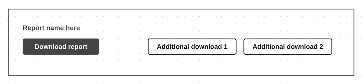
The client also wanted the additional buttons to be in the same prominent position, so our initial solitary download button evolved to become a download module containing the main download (technically a link styled as a button) and the additional download links with some visual delineation.
The subsequent iteration landed well with the client, and they were happy to sign off on it.
A rethink
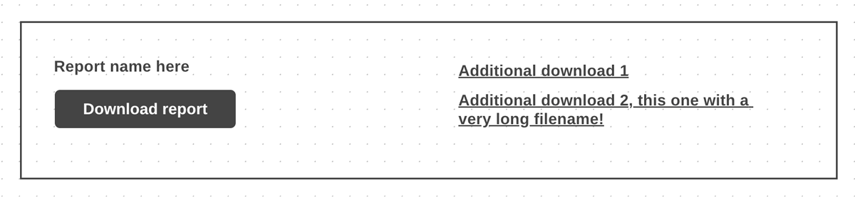
Something hit me soon after. As the reports would be migrated from the old site, we'd need to know what piece of data, from each downloadable file (as it exists as a media library object in WordPress), would be used as the link text(s).
This prompted me to ask the tech lead for a huddle. We investigated the old site and found the files attached to the reports had their title property filled out in shorter, human-readable fashion (in most cases). In some instances the property field was left empty.
We envisaged that the content editors will fill out the title for each new file, but we couldn't expect them to do that retroactively for all downloadable files because there are hundreds of reports.
So newly migrated reports with additional downloads, would include download links that use the title value, if it exists, or if not the filename.
This required an iteration to the design. The additional links would not be presented as buttons, but with regular link styling, and stacked vertically. To better accommodate links that could be very long.
Outcome
At our next design session, we presented the amended design, and the client remained happy. The build of this component was completed within the scoped time.
I can imagine how this might have ended differently if a conventional designer with a lesser understanding of technical implementation was solely tasked with designing the component.
- On the first client sign-off, attention would swiftly move to the next talking point in the design — the designer's remit being primarily to ensure the user needs are met, and the client is happy with the direction.
- At the end of the design phase, the mockups are handed over to the build team. And (as often happens) the designer is moved onto another project.
- A developer picks up the task to build the component, and at this late stage, the design problem is surfaced. The development team, who aren't equipped or in a position to make design iterations, are having to do just that.
And this is where I make the case for the hybrid designer and developer. Or the design engineer, as they are able to make that design intervention much earlier, at a more appropriate stage of the development cycle.
This is not to disparage anyone. I believe there is as much a place for the non-technical designers as there is for the technical designer — discovery, user research, brand integration and establishing the look and feel being a few of the tasks I believe would be in their wheelhouse. Also I acknowledge that a non-technical designer might very well have understood the build constraints. This is a simple example to illustrate my point.
However I've found these constraints are often overlooked, as designers are occupied by the needs of the user and requests of the client, and the developer holds the default mindset of "Whatever you design, we'll build." Which I think submits to the notion that design and development are two very distinct things.
The Design Engineer challenges that fallacy by bridging the gap between designers and developers, and in doing so presents a clear business case for this particular profesional to be part of the development of any digital product.