Personal site build Retro
About this project and aims
It was about time I created a new personal website to talk a bit about myself, my experience, my work and my approach to design and development. To inform any prospective employers, or whoever might want to hire me on a freelance basis. It was also a good excuse to finally try out NextJS, and get used to JSX syntax.
I set about designing this thing. To be honest, I haven’t thought about creating a showcase of my work. Not yet anyway. In a later release, I’ll have a blog section which can house case-studies. My aim is for the site to be an informative narrative about me, with a focus on the content, accentuated by type and iconography.
I wanted this project to give me an excuse to geek out with fonts, specifically a variable font. I attended Elliot Jay Stocks’ typography masterclass, where he taught us about how you can serve multiple needs—headings, body text, taglines, captions etc through a single font file. So I decided to do just that, keep to a single font for the project. By the end I’d decide if this is worth the extra overhead in variable font configuration, as opposed to just adding a selection of fonts from a family.
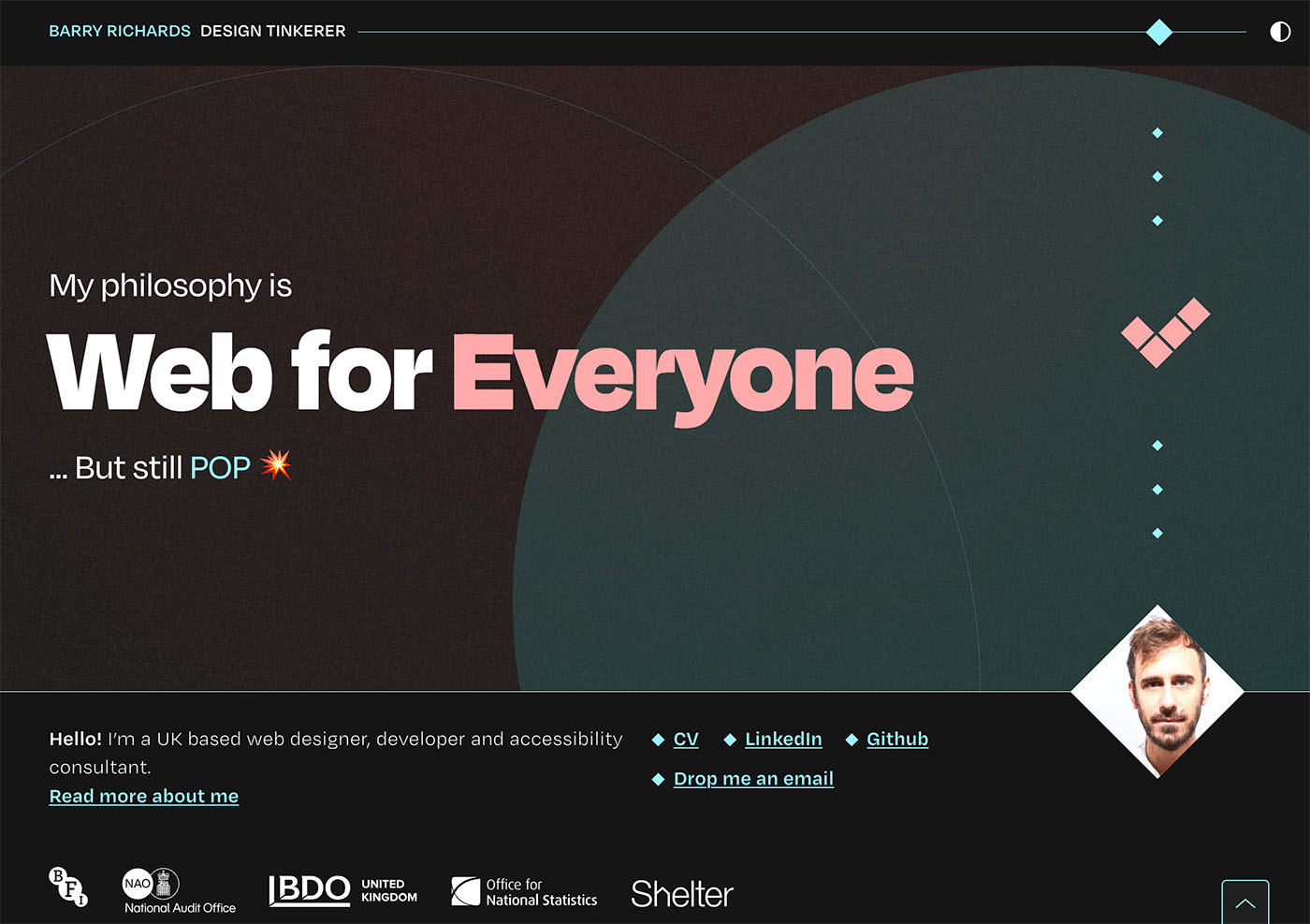
In terms of look and feel, I’ve been inspired by dark-mode colour palettes which I’ve seen a lot of recently. So I wanted to explore a dark theme, with contrasting colours to achieve a vague nod towards a neon-light aesthetic. Of course with a switchable light mode. For anything other than a personal website, I’d make the colour theme default to the OS colour mode, but for this one I decided to make the dark theme default regardless of OS setting. As I think the dark theme is much more impactful, and I wanted to present the best version of the site to people. I also wanted to create my own icons that would complement the theme. As well as some movement, both for the feel of the site, and as an excuse to play around with one of the many React animation libraries.
Outcome and learnings
I have a website. I’m happy with the end result. I’m also far more knowledgeable in React and NextJS than I used to be. That is, I think I’ve still got a heck of a lot to learn, but I’m now clued up on the fundamentals of this JavaScript based framework, and others that are like it. And the advantages and shortcomings of using it. Admittedly, a simple single page website isn’t really much of a test drive, and using it might have been overkill—NextJS is much more suited for complex web apps. Using this approach instead of reaching for WordPress like I normally do, it did however teach me about modular functional components. Not totally sure that’s the right terminology. But the approach of modularising every component into its own function which sits in its own folder within the codebase. And referencing that component from within other components and passing in data to the function. You have the flexibility to go as far as you want with this, for example you could take care of styles via a global stylesheet, the normal way (or maybe not so normal any more?) or you could contain styling within the component folder. As I intended this to be a learn-while-doing experience I decided to go all out by including all component index files and CSS files within its own folder. Isolating all concerns about a component into it’s own little container. The global stylesheet only including the reset rules, and some CSS variables and SASS mixins. And yes, nextJS allows SASS straight out of the box, so that’s nice.
What went well
- Fresh new website and learning experience As explained above.
- Not too much design overhead I had a pretty decent idea in my head what I wanted the look and feel of the site to be, I got it down in Figma pretty quickly. And I didn’t have to iterate as much as I have with other personal projects.
- Kept a release schedule so I didn’t force myself get everything done by a certain time. I released an MVP before I had optimised the content and fixed all issues.
- Thought about accessibility from the outset. When it came to automated testing, there was no surprises.
What could have gone better or took me by surprise
- Build took too long I was working on this on and off for the best part of 6 months. Yes, I know I intended this to be a learning experience with React, NextJS and using variable fonts. And I have learnt a lot. I spent quite a lot of time working on things which I ended up refactoring. And I can’t put everything on the fact that I’m new to this approach.
- Not building and naming modules with flexibility in mind At the start of the build, I made the assumption that the content would follow the pre-written narrative from top to bottom, so I didn’t prioritise flexibility in component structure and naming. I didn’t anticipate the need to rearrange items or create reusable, generic content blocks. As a result, I didn’t consider how components would stack if reordered. To introduce some flexibility, I had to create spacer components, so pairs of components that I didn’t initially expect to have stacked on top of eachother could be stacked. My initial rigid approach also caused issues with component naming. I made the rookie error of naming components based on the specific content I expected them to hold, rather than designing them to be adaptable for multiple purposes. This limitation became apparent as the project evolved and required more versatility.
- Use of variable font. I understand the flexibility to adjust the most miniscule properties of a fonts’ appearance. And I like the idea of serving a website with a single font file. But working with a variable font is a bit of a learning curve. Controlling all the parameters via a single `font-variation-settings` CSS rule is a bit fiddly, because all variations have to be set in a single value. It’s a little unintuitive, for example the optical size of the font I was using (Degular) was represented by a range between two seemingly arbitrary numbers. In a client project, where time is a factor, I wouldn’t use this approach.
- Too much modularisation. As I mentioned, I was perhaps too liberal in making things separate components. And, as each component had it’s own CSS file, it became cumbersome to work with. I was approaching the styling of the site in its entirety, but the modularised component approach lends itself better to components that should be treated in isolation.
- The React/JSX learning curve was challenging. This isn’t necessarily a bad thing as it was a great learning experience. I just wasn’t prepared for the level of abstraction. For example, adding multiple classes to a component was fiddly, another example—I was using the motion animation library. To apply an animation to an element, I had to prefix the name of the element with the keyword motion. So the opening tag of a div would become motion.div. I wasn’t used to this syntax, and hadn’t seen this kind of markup before. I found interpolation a challenge is JSX. I could have built this in HTML and vanilla JS much quicker, but hey that’s not what I set out to do.
For next time
- Plan the component set better. Does it need to be a component? Is it reused? Single responsibility principle.
- Anticipate the likelihood that I may need more flexibility, beyond the needs of the design—would I need to create a generic block with title and description?
- Anticipate that modules can be stacked in different orders.