Satoshi Power
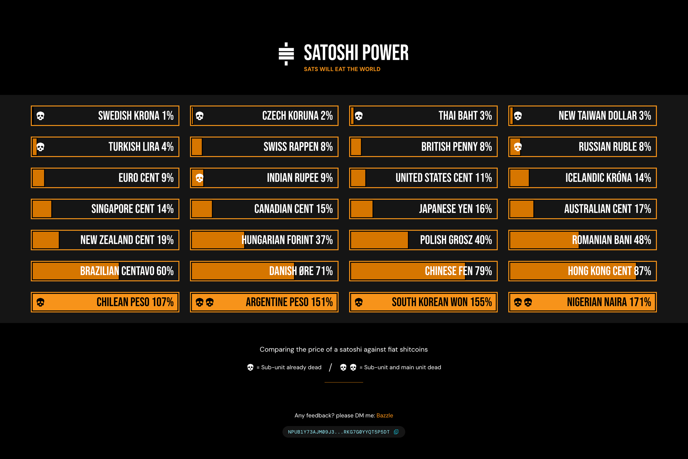
Pulling in data from blockchain.com exchange rates API, I decided to create a tongue-in-cheek infographic, presenting a perspective on how the smallest fiat currency units stack up against satoshis (sats). Which is the smallest unit in Bitcoin. (there are 100m sats in 1 bitcoin)
Goals
These are the hasty back-of-the-envelope goals I defined for myself before I started the project.
- Pull in data from Exchange Rates API, calculations and logic to find percentages against one satoshi, display results in a cool looking infographic
- Achieve fame amongst many plebs
- Iterate often, with each new major version using a new framework or abstraction.
I can say the app does the first thing, I've yet to achieve the second 😅
The third item is not really a goal with a definitive end but something I'm striving for nonetheless.. to use this as a test-bed for different JS frameworks, libraries, abstractions, or build tooling. Not necessarily just by introducing end-user features, but optimising the codebase and learning some new things in the process.
The rough roadmap is this:
- v1 (MVP) vanilla JS, using ES6 modules and other features
- v2 (current) Add TypeScript
- v3 Rebuild in React/Next.js. See how much more lean I can make the codebase using JSX instead of vanilla JS DOM manipulation (and see if there's a performance bump)
- v4 Integrate unit testing using Jest or similar in preparation for v5 which will introduce new features
- v5 Introduce a currency converter UI
Design notes
Look & feel and typography
Bebas Neue was an obvious choice. I needed a condensed font to fit the currency names into the grid segments comfortably. With good language support, for currencies like the Danish Øre, or the Polish złoty.
Behind each currency name, is a block which expands/contracts based on the percentage. I needed to ensure the bg colour of the block has sufficient contrast against the text in line with WCAG guidance. The Bitcoin orange (hex: #f7931a) is not sufficient, So I had to tweak this colour to achieve the required 4.5:1 contrast ratio. When the percentage is > 100, the text can change to black, and the Bitcoin orange can be used. As a result there's a visible difference between the shades of orange used.
Layout
I mocked up a grid layout, with each currency occupying a segment of the grid. Making sure there's no gaps or orphans on desktop and tablet view. This bought into focus the inescapable reality that I might have to omit some currencies that the API provides.
Ultimately I made the decision that this was to be a curated list or currencies, as opposed to "show everything the API returns". With this, I can choose which currencies to show based on how well known they are, and shock value (Nigerian Naira anyone?) And have control of the layout.
Units and sub-units
The biggest design challenge is what units to show. The initial idea is to show comparisons between satoshi's and the smallest units of fiat currencies, but when the smallest unit of Argentine currency for example—the Centavo, is already worth less than 1% of a sat, you can argue the more meaningful comparison is with the main unit, the peso.
However I came to the realisation that being selective about whether to show sub-units or main units, on a per-currency basis isn't the right solution. Considering the units are shown in order of their value against the sat, in percentage terms. You might have, for example the Russian Ruble close in this measure with the US cent—the sub-unit alongside the standard unit, with no visible delineation.
To solve this, I introduced the skull icons. One icon means the sub-unit is already "dead" or of lesser value than a sat. As an enhancement of this playful approach I decided to introduce another skull, to indicate currencies whereby both the sub-unit and main unit are dead. The ultimate badge of shame for inflating fiat currencies 💀
As I progress this project along the roadmap, this post will be updated. Check back soon!